A long-term chart of the copper:gold ratio
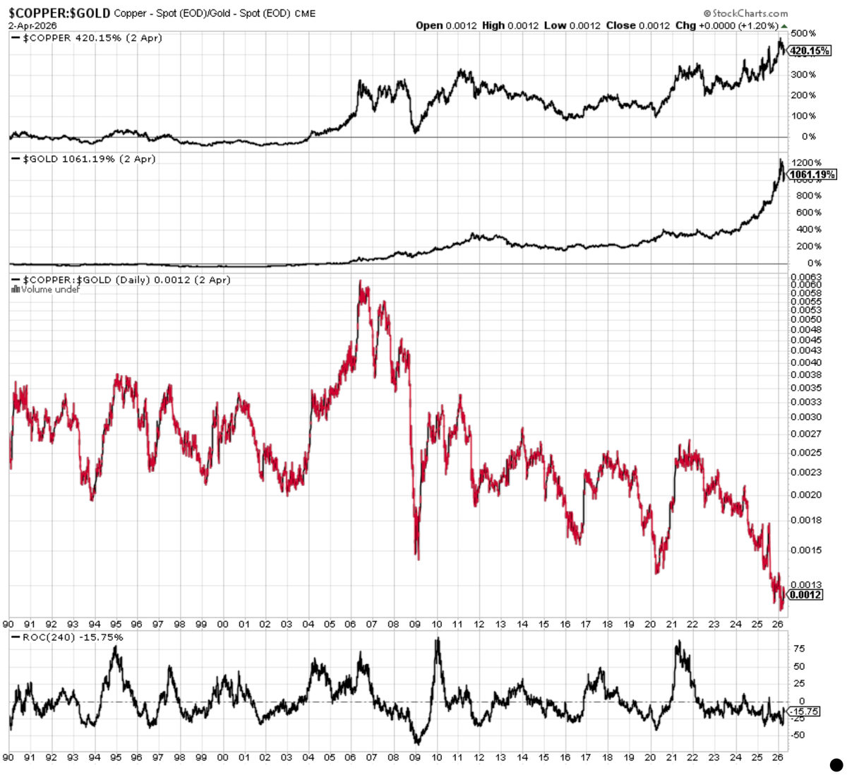
The copper:gold ratio helps orient us in the business cycle.
Copper reflects industrial demand and economic growth. Gold is hard money, reflecting inflation, real rates and economic fear.
The ratio has been in a multi-decade downtrend, either because of improving technological efficiency or slowing economic growth.
Recently it has collapsed toward historic lows. This is a cyclical drop in a long-term secular trend. It's perplexing given the supposed ongoing A.I. infrastructure and electrification boom.
The cyclical troughs on this chart tell the real story:
- 2000–2002 (post-tech bust)
- 2008–2009 (financial crisis)
- 2011 (GFC second bottom)
- 2016 (global slowdown / China deceleration)
- 2020 shock
- Today
All were the tailends of late-cycle slowdowns right before small, value and cyclicals ripped. If the ratio behaves as it did in the past, it's one of the best leading indicators of coming economic acceleration.