History rhymes again: Market vs equal weight

The big versus small cycle shows up in many different ways.
One way is the relationship of the S&P 500—a market capitalization-weighted, float-adjusted index of the largest 500 stocks listed in the US—to the equal-weight S&P 500, which weights every company equally. The market-cap S&P 500 puts more of the index into the bigger companies than the equal-weight version.
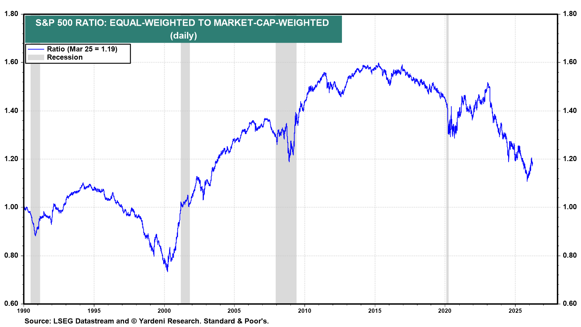
The chart shows the ratio of the equal-weighted S&P 500 (RSP) divided by the market-cap-weighted S&P 500 (SPY)
- Rising line → the average stock outperforms the biggest stocks
- Falling line → the biggest stocks dominate
Over the very long run, the average stock tends to win against the biggest. But not all the time. The market cycles. The biggest stocks have dominated for long periods.
Historical regimes
- Late 1990s (Dot-com bubble)
- The ratio collapsed from the mid 199os to early 2000.
- Big stocks dominated. It is remembered as a tech bubble, but it was a mega cap growth market, which included Walmart, GE and other non-tech stocks.
- Post-2000 (Golden age of value)
- A massive reversal post-2000 saw the ratio surge
- Equal-weight crushed market cap-weight until 2015
- Cyclicals, value, small/mid caps led broad participation in a healthy bull market
- 2015 to 2025 (Web 2.0, social and A.I.)
- A plateau as tech began dominating again from 2015 to 2020
- A sharp drop in the ratio as the A.I. mania kicked off post-Pandemic
- Mag 7 dominance in a mega-cap regime saw the narrowest leadership since late 1990s
We can see the same relationship if we compare the S&P 100—the largest 100 stocks by market capitalization—and the S&P 500.
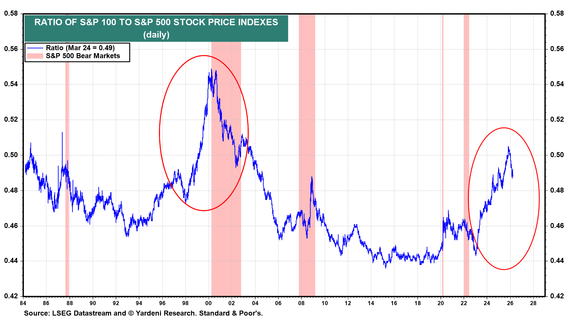
This chart is the mirror image of the chart above because it divides the largest 100 by the 500.
- Rising line → the biggest of the biggest stocks dominate the rest
- Falling line → the average stock outperforms the biggest stocks
The two major spikes circled in red are the tops of two mega-cap dominance regimes:
- 1998–2000 (Dot Com)
- 2023–2025 (A.I. / Mag 7)
What happens after spikes is the whole game
After 2000:
- the ratio collapsed hard as mega caps massively underperformed
- the broad market (especially cyclicals, small/mid and value) led for years
👉 That’s the playbook.
Here are the two series above overlaid in one chart.
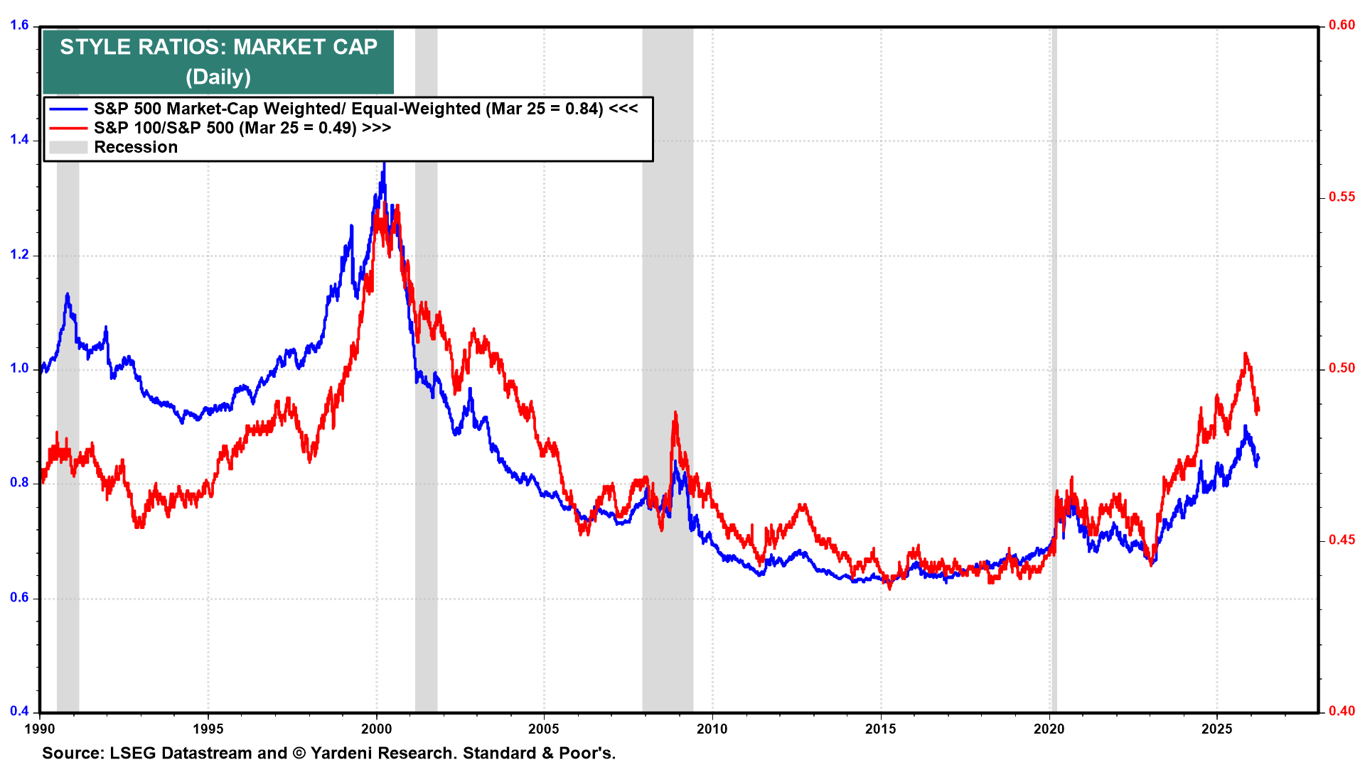
Both lines move together. That’s the signal.
- When they rise → concentration in mega-caps becomes extreme
- When they fall → broad participation, small/mid, cyclicals and value outperform
Right now, both ratios:
- peaked late 2025
- remain elevated
- have begun to roll over
👉 This is early-stage transition behavior. When both ratios peak together, we are at major turning points for multi-year regime shifts.
Not yet confirmed—but very similar to 2000 topping process
The asymmetry is enormous. From these levels historically:
- Upside for mega-cap dominance: limited
- Downside (reversal): very large
And when it reverses:
- Equal-weight outperforms
- Small/mid caps outperform sharply
- Cyclicals lead
- Value wins
We are likely in the late stage of a mega-cap dominance regime, with positioning and flows heavily skewed to a narrow set of names. Historically, similar extremes (e.g., 2000) preceded multi-year periods of broad market outperformance, particularly in value, cyclicals and small/mid-cap equities.